Unlocking the World: The Features, Data, and Ethos Behind the ATP Geopolitics Map
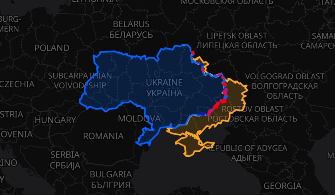
If you have tuned into the ATP Geopolitics YouTube channel recently, you have likely seen our custom mapping platform in action. Whether JP is breaking down the daily 'Hits and Losses' or giving a detailed front line update, the new ATP Geopolitics Map has become the visual backbone of our reporting.
But what exactly is going on beneath the surface of map.atpgeo.com? How do we track the front lines, what technology drives it, and why did we decide to build our own platform from scratch?
This article takes you firmly behind the scenes to explore the ethos, the technology, and the future of the ATP Geopolitics Map.
What is the ATP Geopolitics Map?
At its core, the ATP Geopolitics Map is a bespoke, interactive geospatial intelligence platform. We designed it specifically to provide unparalleled, high-fidelity mapping data for global geopolitical analysis, with a heavy current focus on the conflict in Ukraine.
Officially launched on the 20th of March 2026, this new platform completely replaced the old Google My Maps and Google Earth systems that JP previously maintained.
Unlike off-the-shelf consumer maps, our platform allows users to overlay multiple strategic data sets, compare front line changes, and analyse satellite imagery in near real-time. It features measurement tools, custom radius circles, and Location Intelligence Functions, transforming it from a simple viewing tool into a comprehensive analytical workstation. And whilst it powers the visuals you see on our YouTube channel, it is also a public resource available for anyone to use, explore, and study.
Why did we choose an Open Source, zero-cost ethos?
The fundamental ethos of the ATP map can be summed up in a few simple principles: Open Source, Open Data, and absolutely no SaaS (Software as a Service) subscriptions.
In the modern tech landscape, it is incredibly common to rely on paid, cloud-based services that lock your data behind paywalls, penalise success, throttle your bandwidth, or plaster your screen with advertisements. We rejected that model entirely.
We believe that geopolitical data and front line tracking should be accessible to everyone. Therefore, the map is offered completely for free. There are no paywalls, no advertising banners, and no artificial limits on where you can look or what you can explore. The platform is continuously updated and works just as seamlessly on a mobile device as it does on a desktop computer.
Furthermore, by strictly utilising self-hosted open source software and open data, we have achieved something remarkable: the cost of running this platform in terms of software and infrastructure is £0. There were no upfront software costs, and there are £0 in monthly SaaS fees. Everything is built, hosted, and maintained on our own terms.
Where does the mapping data come from?
A map is only as good as the data it displays. To ensure JP and our viewers get the most accurate, comprehensive, and up-to-date picture of global events, we pull from a massive array of open source and scientific data streams.
Our current data sources include:
- Base Maps: We utilise Open Free Map, Open Topo Map, and the Humanitarian OpenStreetMap Team (HOT) Map to provide highly detailed, community-driven ground truth.
- High-Resolution Satellite Imagery: We integrate ESRI World Imagery and Firefly satellite views for stunning, crisp visuals.
- Live and Cloudless Observation: We tap into European Space Agency (ESA) Sentinel 3 data, offering both cloudless composites and live imagery. Our server generates tiles on the fly from the latest Cloud Optimised GeoTIFF (COG) files, alongside ESA Sentinel Pass Meta Data.
- Thermal and Fire Data: We integrate NASA FIRMS (Fire Information for Resource Management System) data to track active fires and thermal anomalies, which is crucial for identifying strikes and active combat zones.
- Front Line Tracking: We maintain a detailed, timeline-driven layer of the Ukraine War front lines. Crucially, we overlay and compare data from both pro-Ukrainian and pro-Russian mapping sources to provide objective, comparative analysis.
- Custom Overlays: This includes an OpenFreeMap-based custom overlay, various bespoke KML layers, and tools allowing users to draw measurements and strategic circles directly onto the terrain.
How does the map integrate with ATP Geopolitics on YouTube?
If you are a regular viewer, you know that JP will find any excuse to fire up the map! It is an integral part of the channel's DNA. It features heavily in our deep-dive mapping updates and often makes an appearance in the daily 'Hits and Losses' videos.
The map allows JP to visually verify reports, measure distances between front line positions, and show the exact terrain where events are unfolding. As JP himself noted during the platform's introduction:
"We've actually changed the entire mapping platform, so it used to be on My Maps on Google and then Google Earth as well - and now we are using a Ukrainian mapping platform actually called Leaflet where we are able to put sort of different layers in... and we can add loads of really cool things."
He also highlighted the massive leap in performance compared to the old system:
"These maps are so smooth as well, there's no buffering, there's no issues - just really, really great stuff."
How has the community reacted to the platform?
The reception has been nothing short of phenomenal. JP is incredibly enthusiastic about the capabilities it gives the channel, and as he mentioned in a recent frontline update, the automated nature of the map means he can "do more mapping updates rather than the incredibly sporadic updates I do at the moment."
The true success story, however, is the ATP audience. We have developed a dedicated base of regular users who do not just glance at the map - they study it. Our analytics show that it is entirely normal for users to log session times of over an hour, exploring layers, checking front line movements, and cross-referencing satellite data.
The positivity extends beyond our immediate audience. Fellow pro-Ukraine YouTuber Greg Terry has praised the map in the comments, and it has even been spotted making a cameo over on the SkruffyTalez YouTube channel!
What technology powers the map behind the scenes?
Building a high-performance, real-time mapping platform with zero monthly SaaS costs requires a robust, entirely self-hosted tech stack. If you want to poke around the code, you can find our custom overlay work on GitHub at Benniepie/GoogleNerfed.
The engine room of the ATP Map runs on an Ubuntu Server environment, orchestrated effortlessly by Docker Compose.
For the frontend mapping interface, we rely heavily on Leaflet - a brilliant open source JavaScript library that we are particularly proud to use given its Ukrainian roots! We also utilise Maplibre-GL for advanced vector and rendering capabilities.
On the backend, Python does the heavy lifting. We use FastAPI to create lightning-fast data endpoints, whilst Rasterio, Rio Tiler, and GDAL handle the incredibly complex geoprocessing tasks required to manipulate satellite imagery and on-the-fly tile generation. We also use toGeoJSON to ensure all our varying data feeds play nicely together on the front end.
Who is responsible for building and maintaining the map?
The map is a true collaborative effort, built specifically for JP and the ATP Geopolitics channel.
- Created by: BenniePie (with AI coding assistance from Claude and Gemini to speed up development and squash bugs).
- Geoprocessing Engine: Written and engineered by JR. Crucially, JR developed the complex automation models that pull and synthesise the data from various mappers to track changes in the front line. As JP points out, this takes the source maps and "updates them and does loads of other funky things," turning what used to be a manual, tedious plotting process into an automated reality.
What does the future hold for the ATP Map?
We are constantly pushing the boundaries of what a free, open source map can do. Our current to-do list is packed with ambitious features, and we are already experimenting with next-generation geospatial technology.
Right now in the lab, we are experimenting with 3D Mapping using Cesium. This includes creating Quantised Mesh 3D Map tiles using Sentinel radar data combined with 3D models, VR Mapping, and even exploring the bleeding edge of visual rendering with Gaussian Splats.
Here is a glimpse of what is on our roadmap for the public site:
- Dedicated Information Pages: New sections to help users understand exactly what the map does and how to use the channel's tools.
- Performance Upgrades: Continuous optimisation to make tile loading and layer switching even faster.
- Live Shadow Fleet Data: Tracking the clandestine maritime networks operating globally.
- Live Alerts: Dynamic, live data layers detailing air raid alerts, missile launches, and drone strikes as they happen.
- AI-Powered Reverse Geolocation: Tools to help identify terrain and locations from video footage using artificial intelligence.
- Custom Topographical Layers: Further refining our base maps for military and geopolitical analysis.
- ...and much, much more!
How can you explore the map?
The map is live, free, and waiting for you to explore. Whether you want to verify a news report, track a front line, or simply look at cloudless satellite imagery of your own neighbourhood, the tools are entirely at your disposal.
Head over tomap.atpgeo.comand start exploring today.